top of page

XBS Welcome Kit

CrossBorder Solutions

Visual Designer

The Work

Why +
How
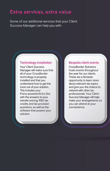
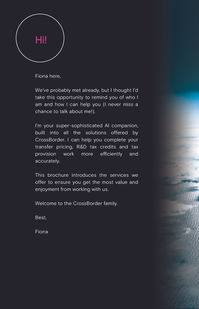
  • A welcome kit built to introduce new clients to CrossBorder Solutions with clarity and confidence. Designed a clean editorial system with a sharp hierarchy and a focused visual world.

  • CrossBorder’s first-touch materials felt scattered and unclear. New clients needed a cohesive welcome experience that set the tone, clarified next steps, and reflected the brand’s technical polish.

  • Built a structured editorial system with a tight hierarchy and purposeful imagery. Streamlined complex onboarding details into a clear, linear flow supported by the brand’s neon visual anchor.

  • Led visual direction across the entire welcome kit, shaping the tone, hierarchy, and layout language. Turned a dense set of internal documents into a clear, branded experience. Designed every spread, refined content structure, and aligned the piece with the broader CrossBorder identity.

    Introduced a visual world that felt premium, modern, and confident.

  • Improved how new clients understood the platform and their onboarding process. Helped Client Success teams deliver a more polished first impression. Strengthened brand perception in early engagements and became a standardized tool used across onboarding, support, and client meetings.

Why +
How

A welcome kit built to introduce new clients to CrossBorder Solutions with clarity and confidence. Designed a clean editorial system with a sharp hierarchy and a focused visual world.

Project Snapshot

CrossBorder’s first-touch materials felt scattered and unclear. New clients needed a cohesive welcome experience that set the tone, clarified next steps, and reflected the brand’s technical polish.

Challenge

Built a structured editorial system with a tight hierarchy and purposeful imagery. Streamlined complex onboarding details into a clear, linear flow supported by the brand’s neon visual anchor.

My Approach

What I Brought

Led visual direction across the entire welcome kit, shaping the tone, hierarchy, and layout language. Turned a dense set of internal documents into a clear, branded experience. Designed every spread, refined content structure, and aligned the piece with the broader CrossBorder identity.

Introduced a visual world that felt premium, modern, and confident.

What It Did

Improved how new clients understood the platform and their onboarding process. Helped Client Success teams deliver a more polished first impression. Strengthened brand perception in early engagements and became a standardized tool used across onboarding, support, and client meetings.

bottom of page